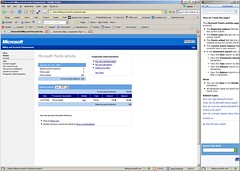
 This afternoon I’m on xbox.com trying to find a way to get more points onto my Xbox Live account. I can find a bunch of information on how to do it from the Xbox Dashboard on my 360, but I can’t find a way to do it on line. At least, I can’t find a way to get my credit card information added on line. But, what almost bothered me even more was their help functionality in their billing application. It is terrible.
They use the same paradigm as Office does. They open a sidebar and resize your main window to display your help. I hate this. I think for a desktop application it can be OK, but I prefer a totally separate window that is on top of my current one. I know the benefit of the sidebar approach, but I really hate my browser being resized. What’s worse is that when it is resized the sidebar help text doesn’t even fit in the newly opened sidebar. Frustrating.
In the end, I’m just going to head home and do this there. I’m really surprised that it has to be so difficult to take my money away from me.